Creator Ecosystem + Livestream Monetization
ROLE
Product Designer
TOOLS
Figma, Adobe Photoshop, Jira, Mobbin
USERS SERVED
3 million+ monthly active users
COLLABORATORS
UX Designers, Brand Designers, Product Managers, UX Researchers

OVERVIEW
The assignment
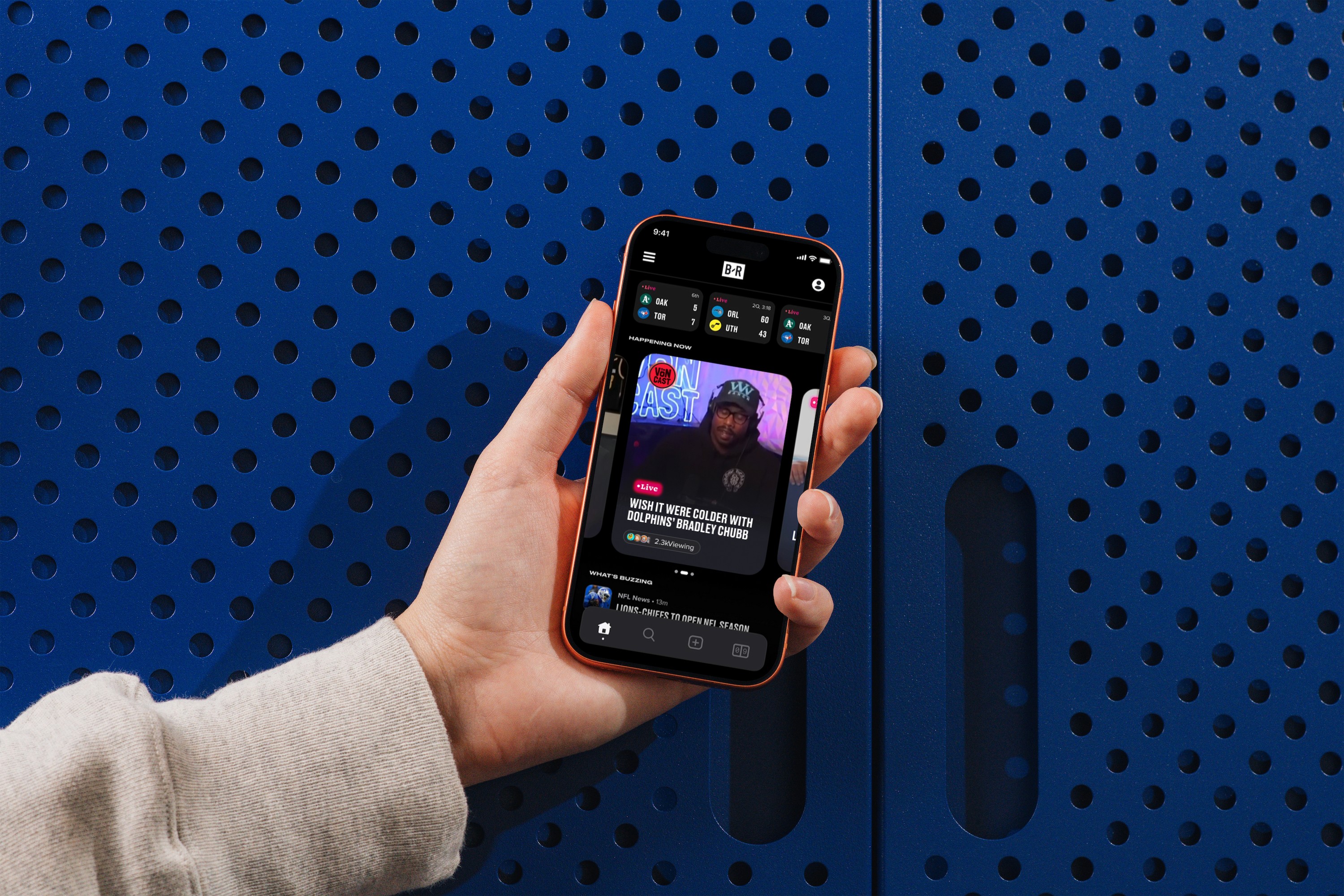
Bleacher Report bridges sports and culture for millions of users. By summer 2023, the team was in the middle of a strategic shift — away from a legacy news format toward a creator-led platform. Premium creators were hand-picked by the programming team, but the goal was to open that up so anyone could create content.
The immediate problem: the livestream experience had not caught up to that ambition. There was no monetization layer, limited creator tools, and no infrastructure to incentivize the behavior — from viewers or creators — that would make the shift commercially viable.
My role was to design the feature set that would bridge that gap: a monetization and engagement system built for livestreams, from research through to high-fidelity prototype.
Everything wrong with the previous iteration:

No creator-based features
(e.g. multi-guest dial in or creator profiles + community spaces)
Lack of monetization
Chat UI is unstructured and lacks monetization features to retain creators
Maximalist UI
There are a lot of tight components on the page without much breathing room
THE PROBLEM
Placeholder
There was no portal to be confusing — that was the point. But two problems made its absence costly, and each demanded a different response.
The user problem
How might we create a concise, pleasurable experience for users by improving upon the creator and livestream experience?
The business problem
How might we increase revenue by monetizing creator livestreams?
BRIDGE
The two problems were inseparable. A monetization system that felt transactional rather than fun would not get adopted. Engagement and revenue had to be designed as one system, not bolted together.
RESEARCH METHOD
Placeholder
METHOD 01
White paper research
Before touching Figma, I reviewed existing UX research on creator platforms, viewer psychology, and livestream engagement patterns. This gave me a foundation before talking to anyone internal.
METHOD 02
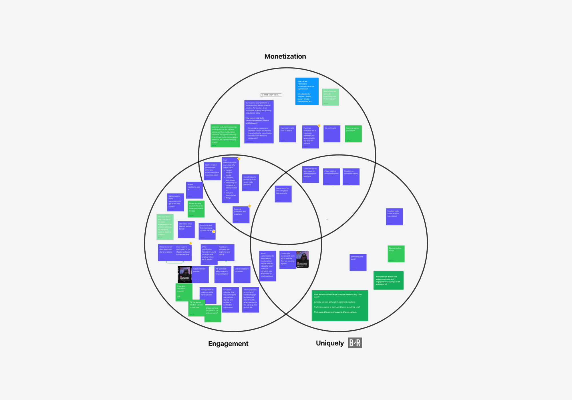
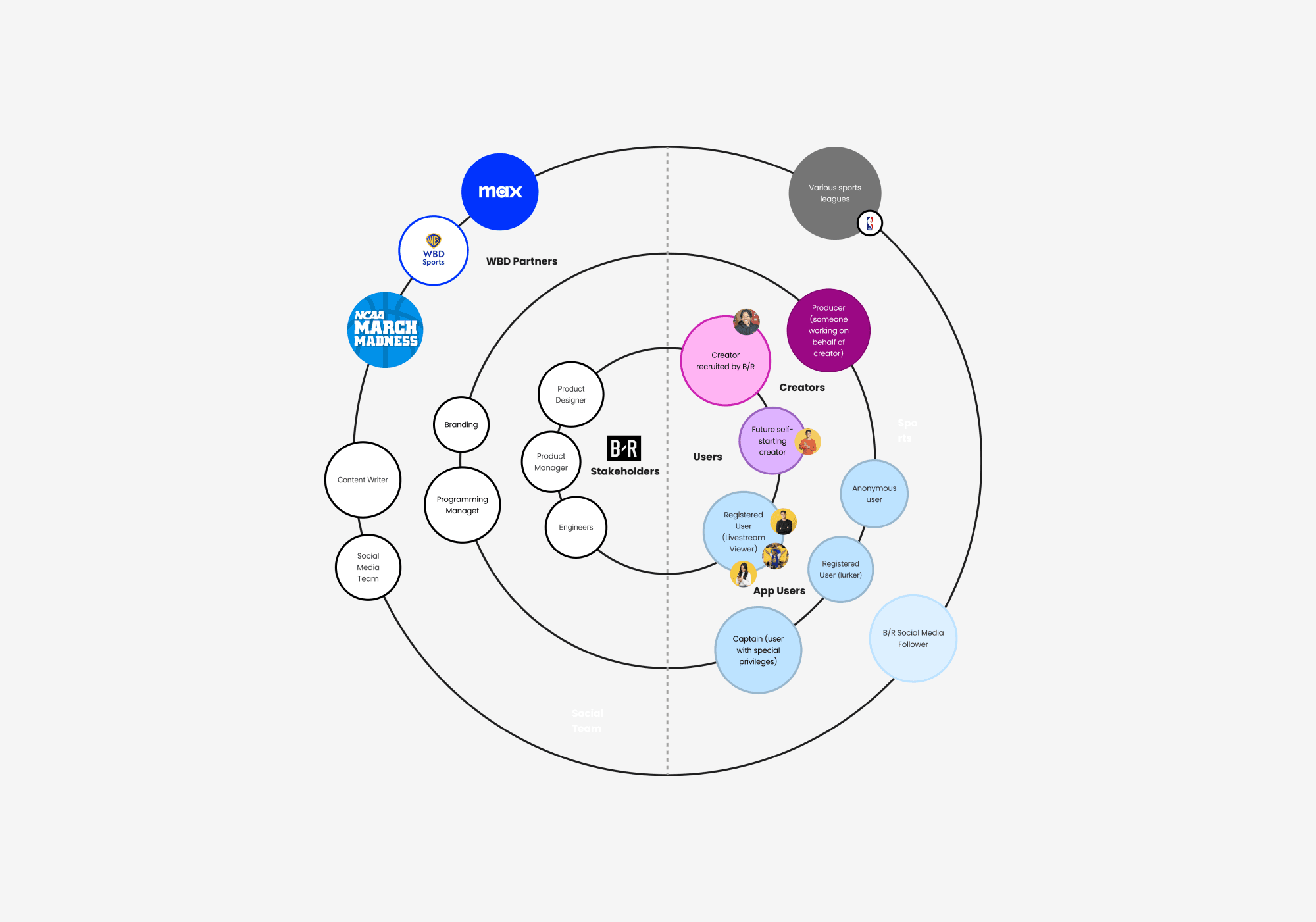
Stakeholder mapping
I mapped all stakeholders involved — internal and external — to understand whose needs to prioritize and who to involve in design reviews. This also helped me identify which product managers owned adjacent surfaces and whose sign-off mattered.
METHOD 03
Competitive analysis
I analyzed leading social platforms through the lens of creator and viewer features — using Mobbin to pull documented flows — breaking each platform down by key features, app screens, audience, weaknesses, and opportunities. Platforms reviewed included Twitch, TikTok Live, YouTube Live, and Reddit.

METHOD 04
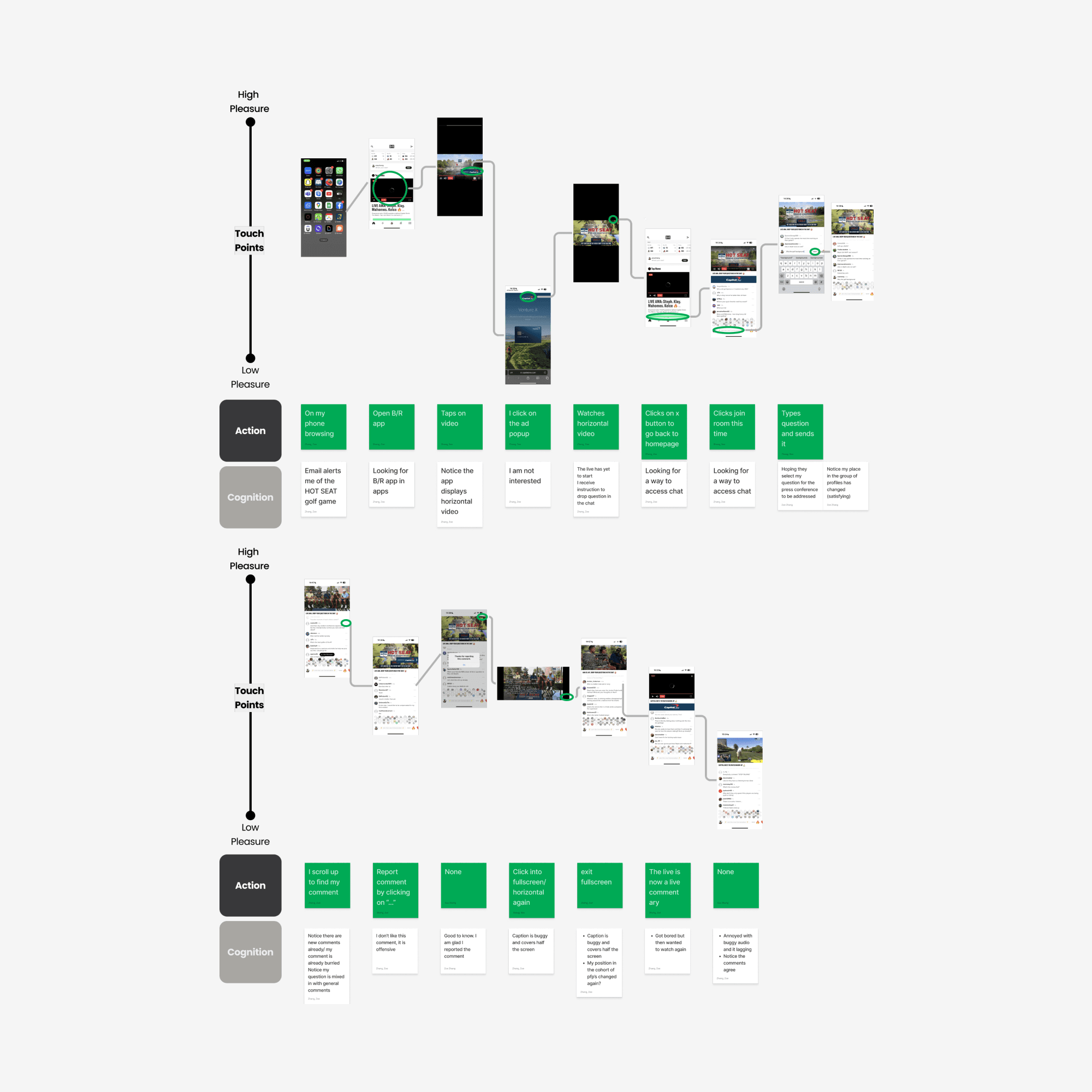
Journey mapping from firsthand observation
I analyzed leading social platforms through the lens of creator and viewer features — using Mobbin to pull documented flows — breaking each platform down by key features, app screens, audience, weaknesses, and opportunities. Platforms reviewed included Twitch, TikTok Live, YouTube Live, and Reddit.
FINDINGS
The core insight
The energy is already there. The product just isn't capturing it.
Sports fans are inherently competitive, social, and motivated by recognition. The research didn't reveal a need to manufacture engagement — it revealed that the existing engagement was leaking out of the product because there was no system to channel it.
The design opportunity was not to add features for their own sake. It was to build a monetization and engagement architecture that converted existing fan energy into product behavior: watching longer, tipping creators, competing with other fans, and coming back for the next stream.
DESIGN SYSTEM
Design system Approach
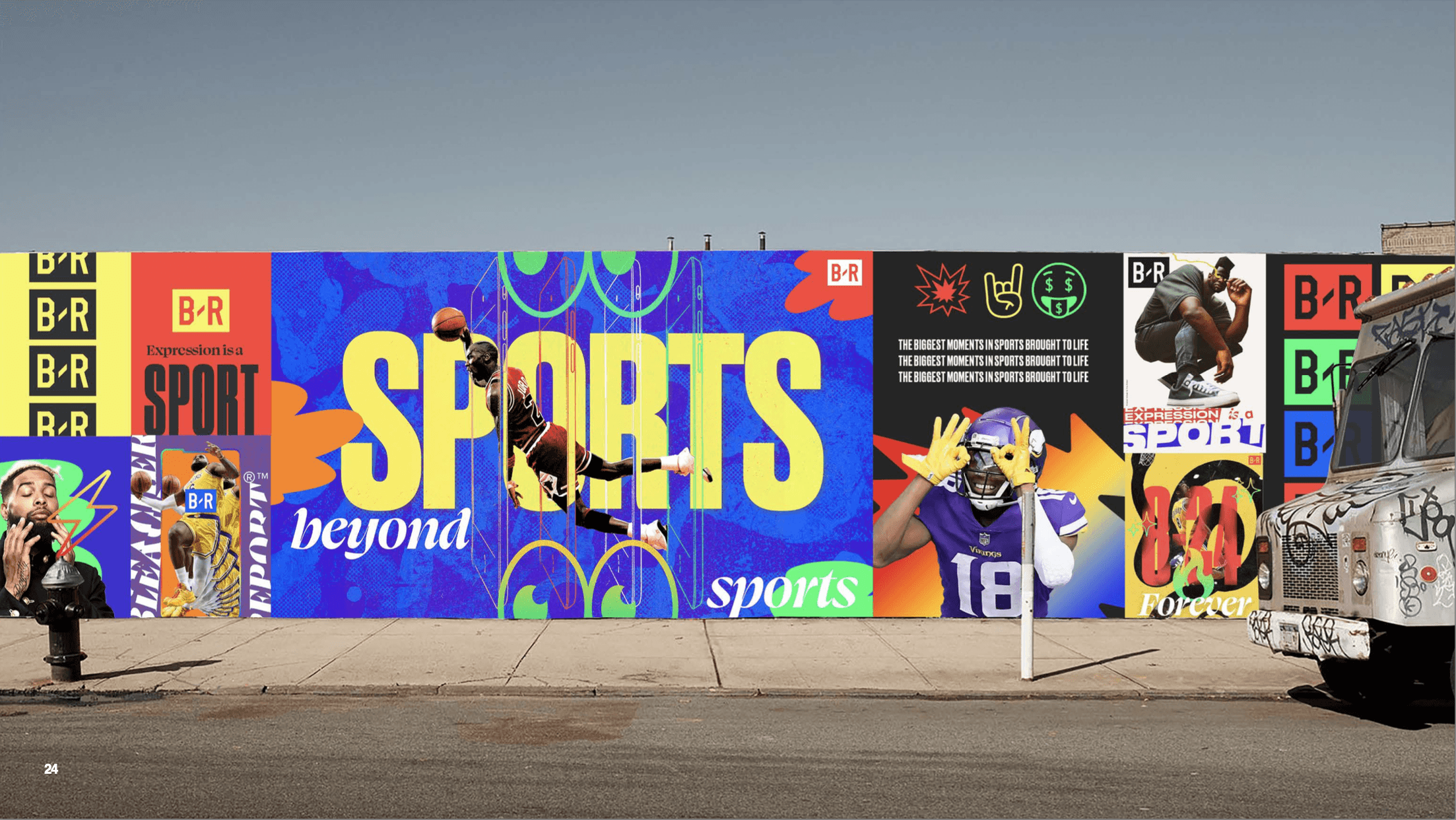
The feature set required a component library that could scale across multiple surfaces — in-stream overlays, wallet and purchase flows, collection views, and notification states — without requiring a new design spec for each one. I worked within B/R's existing brand system, selecting third-party imagery with consistent color palette and composition to maintain visual coherence at speed.
The iterative process moved between low and mid fidelity simultaneously rather than sequentially. Features were tested at a UI level before being fully resolved, which allowed the system to respond to new insights without requiring full rebuilds.


APPLYING THE SYSTEM
Placeholder
Feature 1: Player card system
Purchasable digital tokens featuring athlete player cards, visible to all viewers when sent during a stream. Player cards tap into two proven engagement mechanisms simultaneously: the social visibility of tipping (everyone sees it) and the collecting psychology of completing a set. Creator player cards also function as a direct tip, with all proceeds going to the creator.
Feature 3: Coin system
A hybrid of Reddit karma and Twitch points — earned through community participation and spent on player cards. The dual function (reward for engagement, currency for spending) creates a loop that ties passive viewership to active participation and spending behavior.
Feature 4: Lottery
At stream end, users can enter to win rare player cards from a collection. This introduced a specific behavioral incentive: stay until the end, and rewatch VODs. Two behaviors the business needed, built into a single mechanic.
Feature 5: Live polls
Creator-generated polls during the stream, shareable externally. Designed to increase in-stream participation and drive social distribution simultaneously.
Feature 6: Dial-in
Viewers can request to join the livestream as a guest. The UI adapts to show both creator and viewer live on air. This collapses the distance between creator and audience, generates organic reaction from other viewers, and raises the ceiling on what participation means in a B/R stream.
Feature 7: End-of-stream leaderboard
A post-stream ranking of top tippers, visible to all viewers. Closes the engagement loop — the recognition economy that motivated sending player cards is fulfilled publicly at the end of every stream.
KEY TAKEAWAYS
Placeholder
Engagement and monetization are the same design problem
A feature that asks users to spend money in a context where they are not emotionally invested will fail regardless of how well it is designed. Every monetization feature in this project was designed as an engagement feature first, with the financial layer added as a natural extension of behavior the user already wanted to do.
Map the ecosystem before you map the screens
Familiarizing myself with the full B/R product ecosystem early — attending streams, understanding existing creator flows, meeting adjacent PMs — meant my design decisions were informed by real context rather than assumptions. The stakeholder map was not an exercise, it was a navigation tool I used throughout the project.
Non-linear process produces better systems
Moving between lo-fi and mid-fi, letting features inform each other, and updating the app flow diagram continuously produced a more coherent system than a linear handoff process would have. The coin system, the player cards, and the lottery were not designed separately — each one changed the others.
Research should inform what gets built, not just how
Every decision tied to a specific behavior change and business result — fewer tickets about a named confusion, lower drop-off at a named step — not a better experience in the abstract. That's how design earns ownership at a company shipping its first product.